The Looks-Done Trap: What AI-Generated Prototypes Skip on Data-Heavy Products
A prompt can produce a screen that looks finished in an afternoon. On data-heavy products, 'looks finished' and 'is finished' are answered by two completely different lists of questions.

A prompt can produce a screen that looks finished in an afternoon now. On dashboards, internal tools, and anything with real permissions behind it, "looks finished" and "is finished" get answered by two completely different lists of questions. I've spent years building out the second list, one client project at a time.
What's actually different this year
Tools like Claude Design and Figma's design agent can now take an idea, a screenshot, or a rough description and hand back something that looks like a real product — not a wireframe, not a mockup, an actual editable interface with real components. Anthropic built its version specifically for people who've never opened Figma: founders, PMs, marketers. That's a genuinely useful thing to exist, and I'm not going to pretend otherwise.
I work with founders and product teams building data-heavy web apps — dashboards, internal tools, platforms with real permissions and real business logic behind every screen. On that kind of product, a generated prototype can look completely done and still not have an answer for a single one of the questions that actually determine whether it works.
The gap doesn't show up in a demo
Here's the pattern I keep running into, across very different products: the screen that looks finished handles the case where everything goes right. One user, one role, a normal amount of data, nothing missing, nothing wrong. That's the version that shows up in a prompt-generated prototype, because it's the version that's easiest to imagine and easiest to render.
The questions that actually decide whether a data-heavy product works are all versions of "what happens when it's not that":
- What does this screen do with 40,000 rows instead of 12?
- Who's allowed to see this field, and what does the screen look like for someone who isn't?
- What happens the moment two people are using the same account at once?
- What does the user see when the data behind this screen is late, incomplete, or wrong?
- What does undo actually look like, once other systems have already reacted?
None of that is visible in a demo. All of it shows up in production, usually in the first messy week with real users and real data.
Three places I've had to answer this for real
I'm not describing a hypothetical. This is the actual shape of client work.
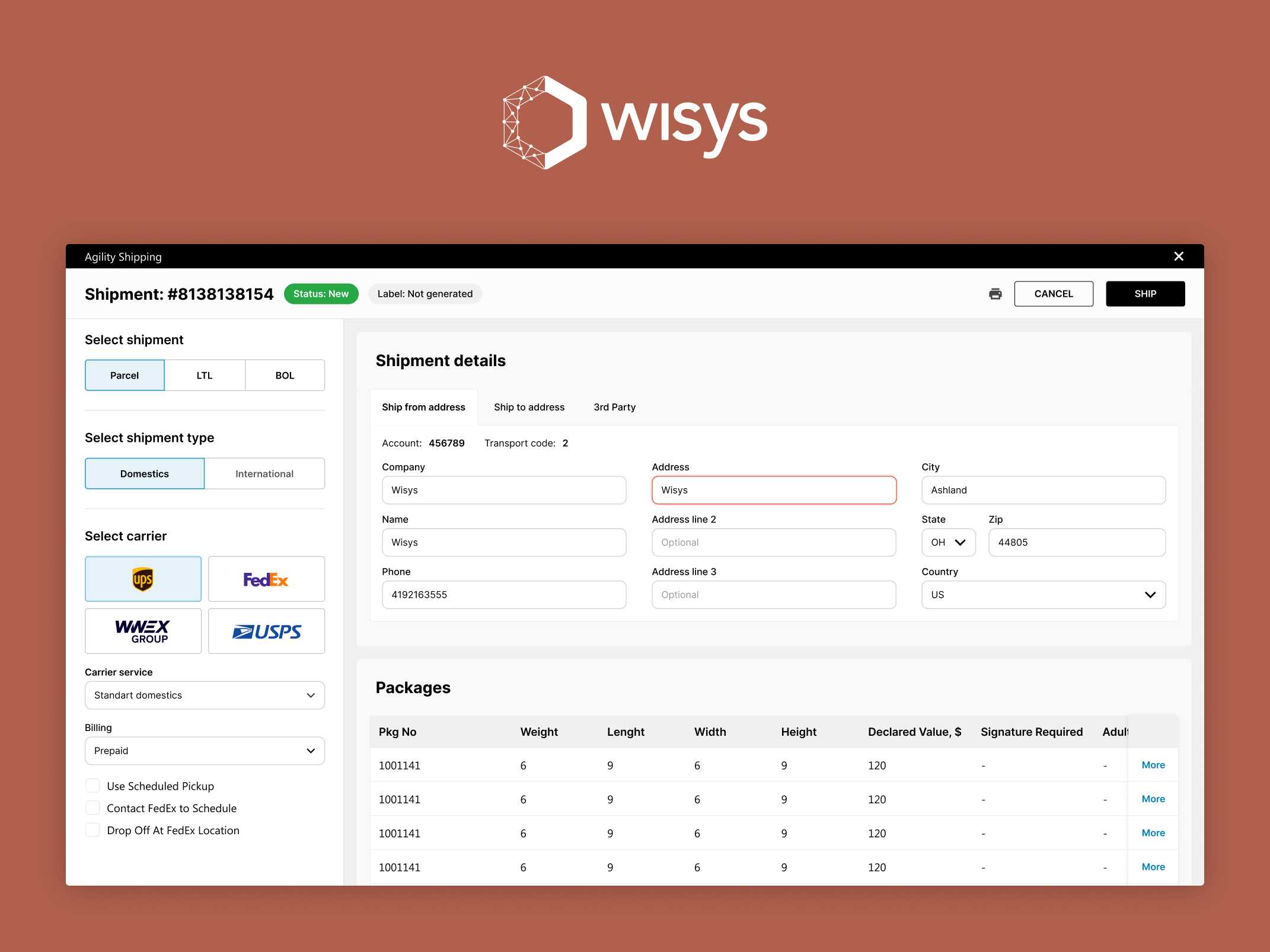
Permissions and multiple people on one screen. When I rebuilt WiSys's Agility Shipping app for warehouse teams and shipping clerks, one requirement drove a lot of the design: the app had to run two ways — embedded in WiSys's warehouse management system, inheriting a session automatically, and standalone, with nothing to inherit. Standalone mode needed its own login, its own permission model, and support for multiple shipping clerks sharing one terminal across shifts. A prompt-generated version of this screen would nail the happy path — pick a carrier, enter a package, print a label. It wouldn't know that "who's logged in on this shared terminal right now" was a real question the product had to answer on every single screen.
The same project also had to decide which fields to show and when. Hazmat declarations and international customs documentation only matter for a fraction of shipments, but when they matter, they're not optional — miss one and the shipment doesn't move. I designed those fields to surface only when a shipment actually needs them, so the everyday case stays simple and the regulated case stays complete. That's a data-model decision as much as a layout decision, and it's exactly the kind of thing that doesn't show up until someone asks "what happens with a hazmat shipment" out loud.
Matching the data model to how people actually think. When I audited and redesigned Steady's Income Passport — the tool gig workers use to verify income and access benefits that normally require documentation they can't easily produce — I found that the income report submission flow was structured around how a database wanted the data recorded, not around how gig workers actually think about their earnings across multiple platforms and pay schedules. I redesigned it around the second one. I also rebuilt the error handling throughout the product so that every message says what went wrong, why, and what to do next, surfaced right where the failure happened instead of buried at the bottom of a form. For a product where a failed verification can mean a missed rent payment, that's not polish. It's the actual product.
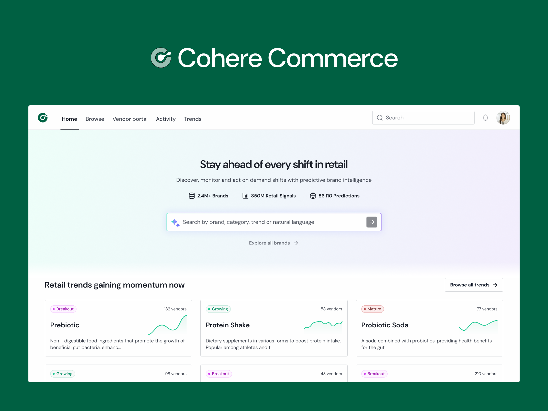
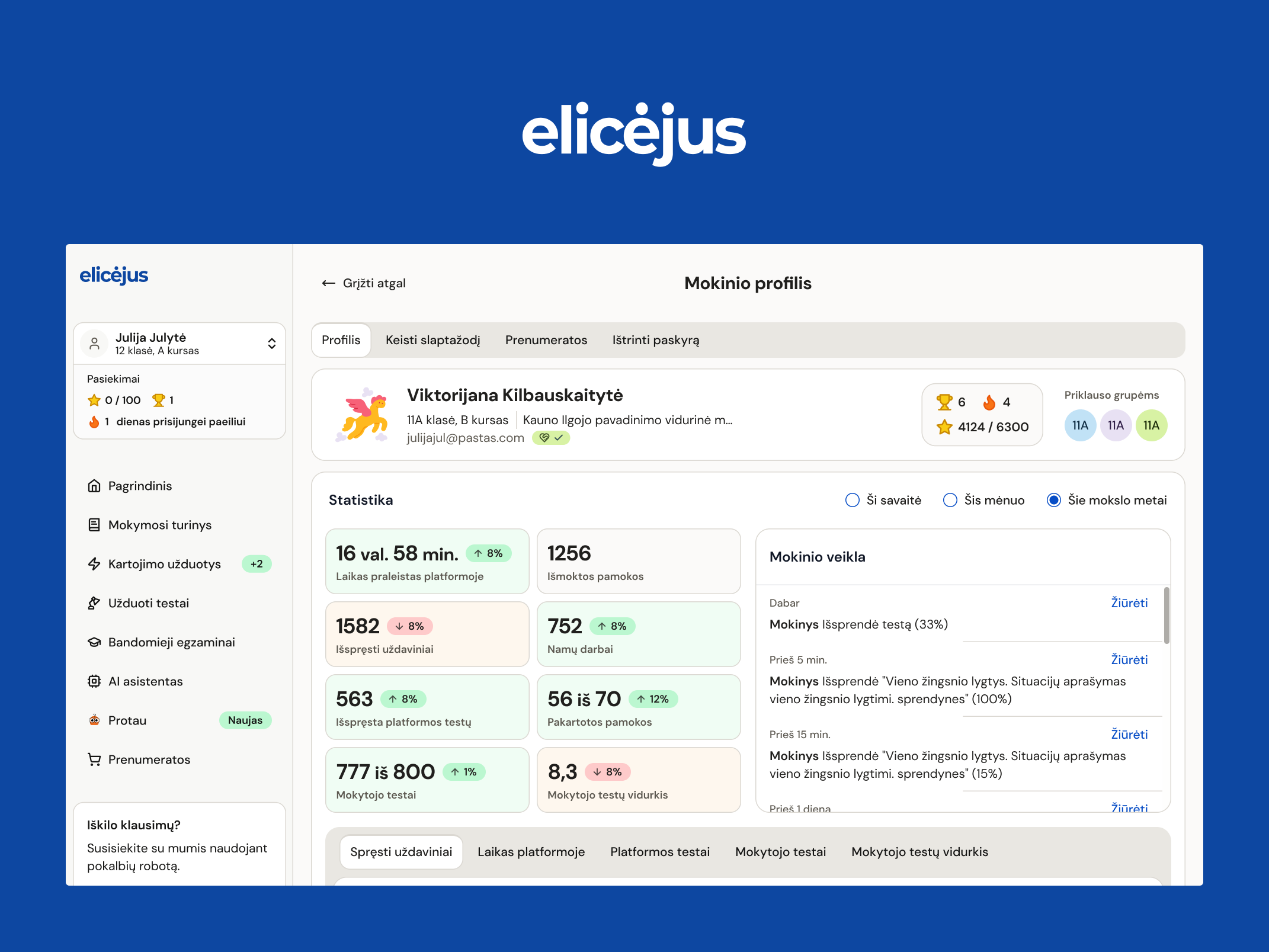
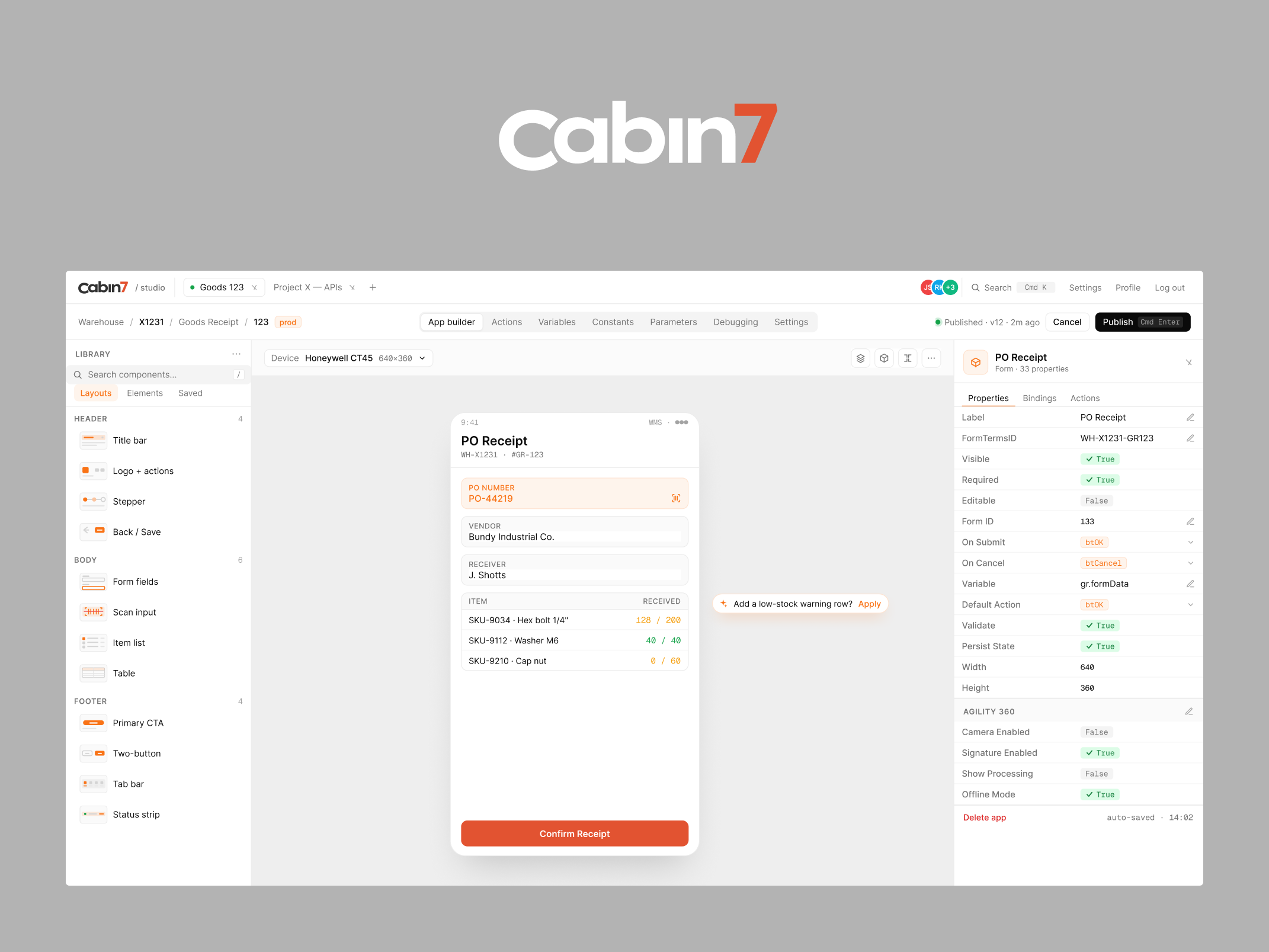
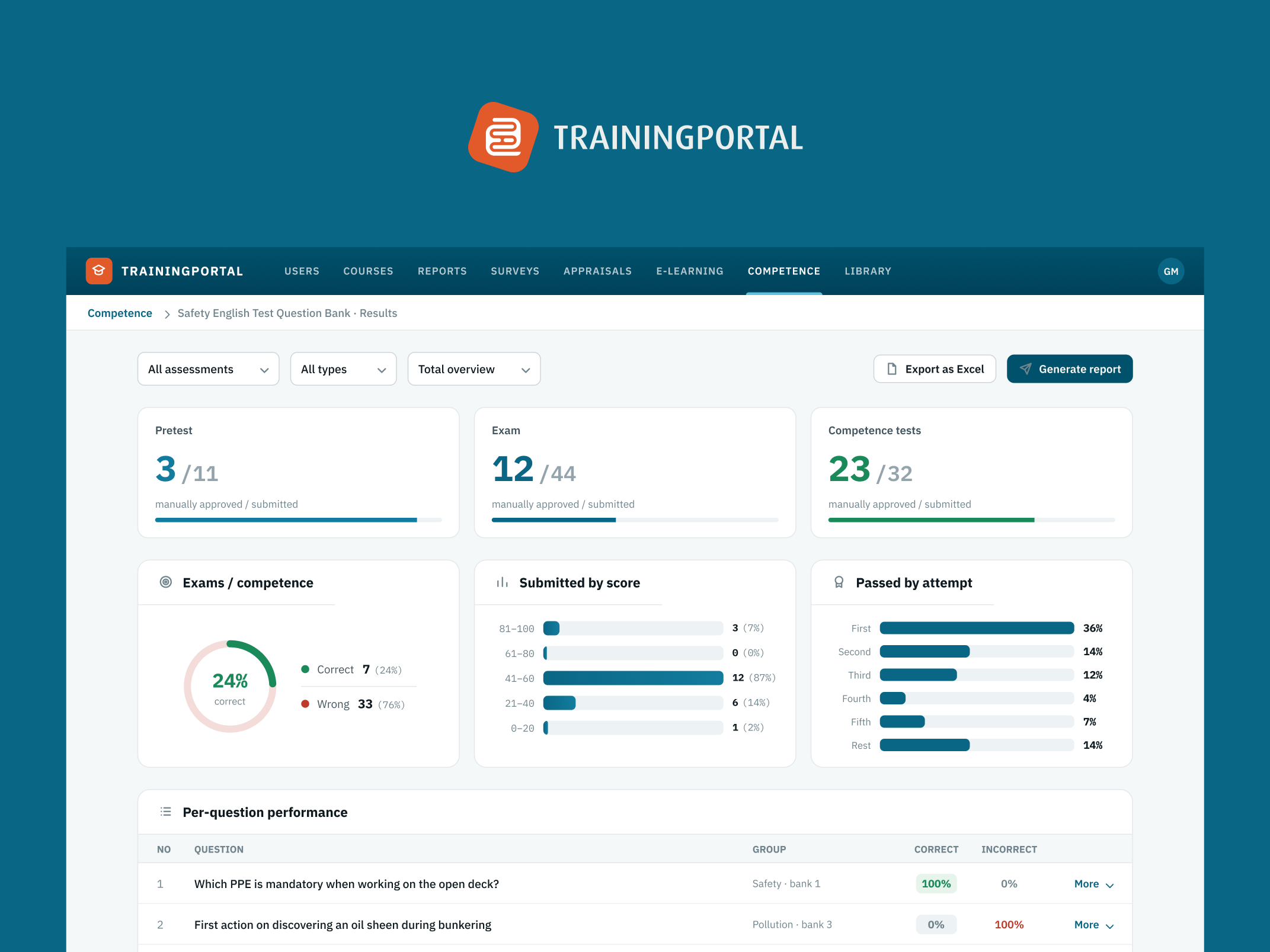
Visibility and undo. On Cabin 7, a no-code app builder I designed for WiSys, every automated workflow writes to a log I called Traces — what triggered it, what ran, what data moved, where it failed — with version rollback so a bad configuration change can be reverted instead of lived with. On Cohere Commerce, brands get notified the moment a retailer's action changes their status, instead of finding out later. On Mintra's exam platform, bulk actions that touch a lot of records at once ship with an explicit confirmation step, because reversibility and scale working against each other at the same time is exactly when a mistake gets expensive.
None of these were exotic asks. They were the ordinary, unglamorous parts of the brief that don't show up in a first draft, generated or otherwise, because nobody thinks to ask for them until something has already gone wrong once.
Why a generated prototype can't get you here
This isn't a knock on the tools. A model generating a screen from a prompt is working from the same input a designer gets in a kickoff meeting — a description of the happy path, because that's what people describe first. Getting past the happy path takes something a prompt can't do on its own: sitting with the actual data, asking the client what happens when a shipment is hazmat or a terminal has three people sharing it, and treating those answers as design requirements instead of engineering afterthoughts.
That's audit work, not generation work. It's the same reason a documentation review catches things a first draft doesn't — someone has to go looking for the case nobody mentioned, on purpose, before it becomes a support ticket.
The five-question check I'd run on any generated prototype
If a prototype — AI-generated or otherwise — is about to become a real product, this is roughly the order I'd check it in:
- What does this screen do with realistic data volume, not the ten clean rows in the demo?
- Who else has access to this, and does the screen change for them?
- What happens when two people touch the same record at once?
- What does the user see when something's wrong — missing, late, or incorrect data — and does the message tell them what to do about it?
- If this action is hard to reverse, is there a pause point or a confirmation before it fires?
A prototype that hasn't answered these yet isn't finished. It's a very convincing first draft — which is a real and useful thing to have. It's just not the same thing as done.
If your product is data-heavy
The more your product touches money, compliance, shared accounts, or anything hard to undo, the more these five questions stop being nice-to-haves and start being the actual scope of the project. I'd rather find that out in a working session before a single screen gets built than have a client find it out from a support queue six weeks after launch.
A closing thought
The tools generating prototypes this year are genuinely good at the part of design that used to take the longest: getting something on screen to react to. That's worth being honest about, not defensive about. What they're not doing — what I haven't seen any tool do yet — is sit with a client's actual data and ask what happens when it misbehaves. That's still a conversation, not a prompt.
If you've got a prototype — generated, hand-built, or somewhere in between — and want a second pair of eyes on what it hasn't answered yet, that's exactly the kind of review I do with product teams before a build starts.
Gytis Markevičius
Founder, GytisMark Studio — gytismark.com
More writing

Book a 20-minute intro call
Slots show in your own time zone.
Let’s see if it’s a fit.
Twenty minutes is usually enough: the role, the product, and how your team works.


Ask AI about my work
AI answer, based on my case studies and CV
Answers show up here as they're written. I keep them short and point you to the case study they come from.
AI can get things wrong. If something matters, check the case study or email me at hi@gytismark.com.