An MVP Dashboard for Income Report Case Workers
Steady’s management portal is the internal tool used by the case workers and programme managers who review income reports submitted through the Income Passport. When a gig worker submits their income verification, it enters a queue — and someone on the Steady team has to review it, validate it, and process it.
The existing process was fragmented. Case workers were navigating between multiple screens and tools to complete what should have been a straightforward review workflow. The full portal was redesigned.

Overview
- 01
The problem
Case workers reviewing income reports were moving between multiple screens and tools to finish what should have been a straightforward review.
- 02
What I did
Designed the MVP — a dashboard for case workers and managers, a redesigned report review interface, and role management tools.
- 03
The results
The complete design, Figma handoff documentation and design system were delivered for development. The engagement ended before launch, but engineering had a complete, well-documented foundation to build from.
Two users with different jobs, one shared interface
The portal had to serve two roles with genuinely different needs — and getting the balance right was the central design challenge:
Case workers review individual income reports. Their primary need is an efficient queue they can move through quickly and accurately — open a report, review the income data, validate it, mark it complete or flag it for follow-up. Speed and clarity matter because they’re doing this repeatedly throughout the day.
Programme managers need aggregate visibility — not the detail of individual reports, but an overview of how the team is performing. How many reports are pending, how many processed, where are bottlenecks forming, which case workers need support. They’re managing throughput rather than doing the reviews themselves.
The tension: the same interface needs to support both heads-down individual review work and the oversight perspective of a manager. Interviews were run with both roles before designing anything, and the personas that came out shaped every layout decision.
What was designed
Customisable dashboard
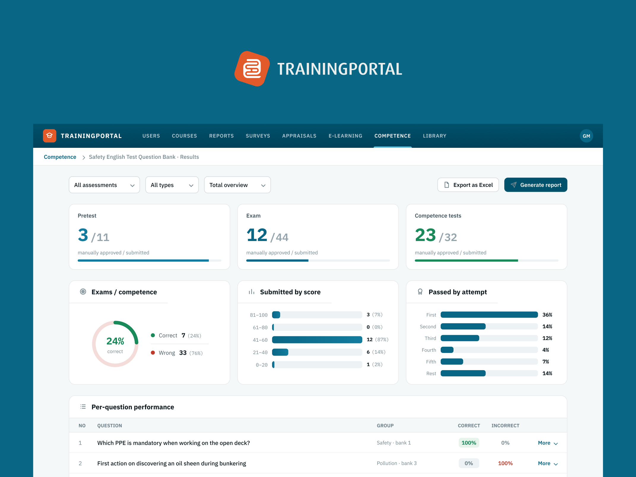
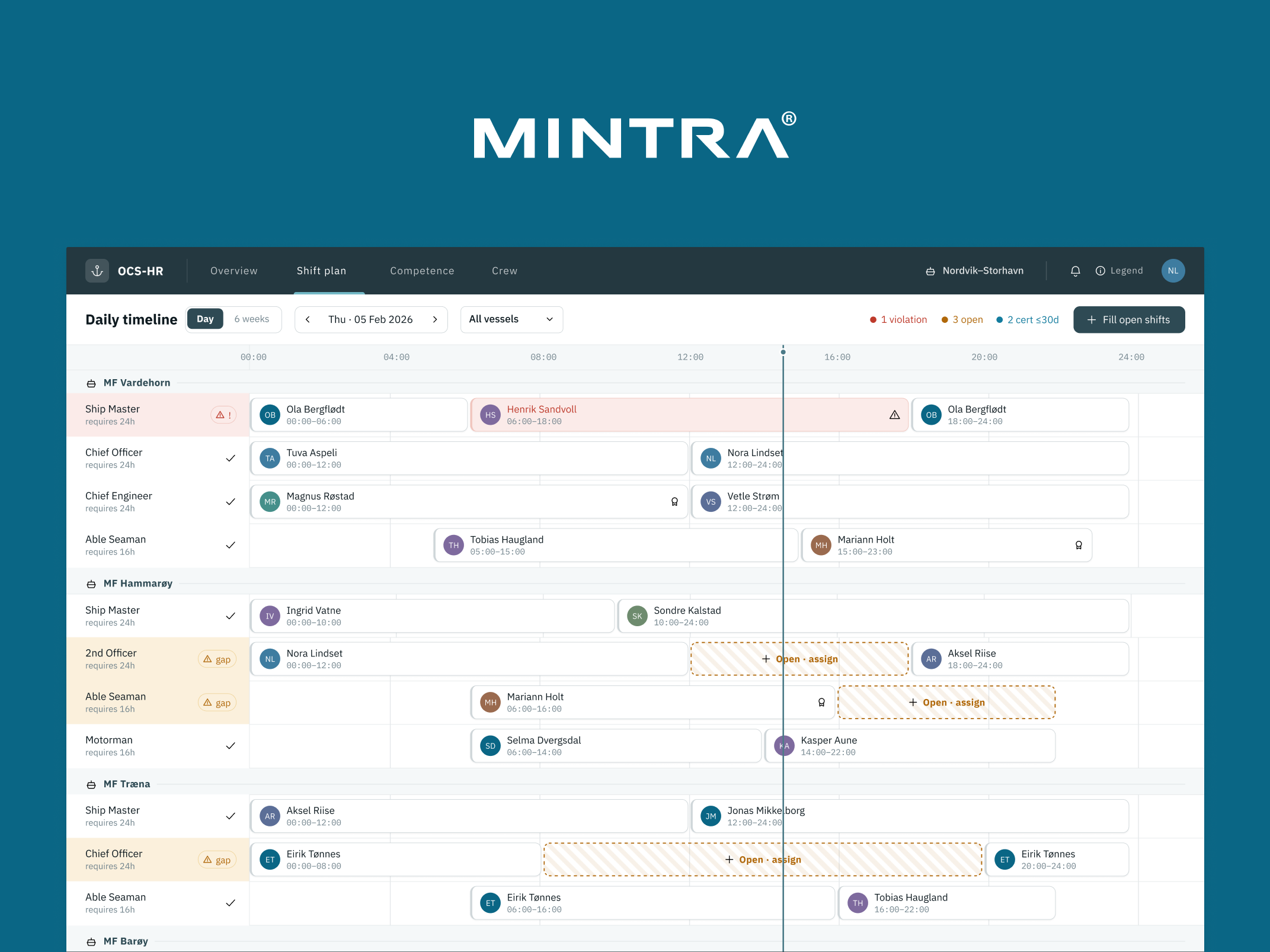
The dashboard serves both user types through customisation — case workers configure it to show their personal queue and pending items; managers configure it to show team throughput, queue depth, and workload distribution. Neither has to work around the other’s view.
The dashboard surfaces:
- Personal queue sorted by priority and age
- Programme-level metrics for managers: total reports in queue, processed today, average processing time
- Alerts for reports that have been waiting too long or flagged items unresolved
Redesigned income report format
The income report format case workers review was restructured around how they actually move through a review — not how the data was stored in the system:
- Income sources grouped logically — related earnings presented together rather than in database entry order
- Verification indicators showing each data point’s confirmation status at a glance
- Inline flagging and notes visible to other reviewers without requiring an external tool or email thread

Role management
The portal serves multiple programmes with different data access requirements. A role management system was designed, giving administrators control over which case workers access which programme’s reports, what level of data each user can see, and manager vs. case worker permissions within each programme.
An MVP delivered for development
This was an MVP engagement. The complete design, Figma handoff documentation, and design system were delivered for the development team to build from. The product was at an early stage, and the engagement ended before it was deployed to users. The design gave the engineering team a well-documented, complete foundation — rather than the common alternative where development starts from sketches and design decisions get made during implementation.


Client feedback