Redesigning two compliance-critical products used by 2M+ workers
Mintra’s OCS HR is a crew management platform used by shipping and energy companies to plan and manage their workforce across ships and installations worldwide. The full system was redesigned — used daily by planners scheduling crew, ship masters managing their vessels, and individual crew members checking their own records.
Outcomes
What changed because of the work.

+29%
workflow efficiency
−18%
audit findings, year on year
2M+
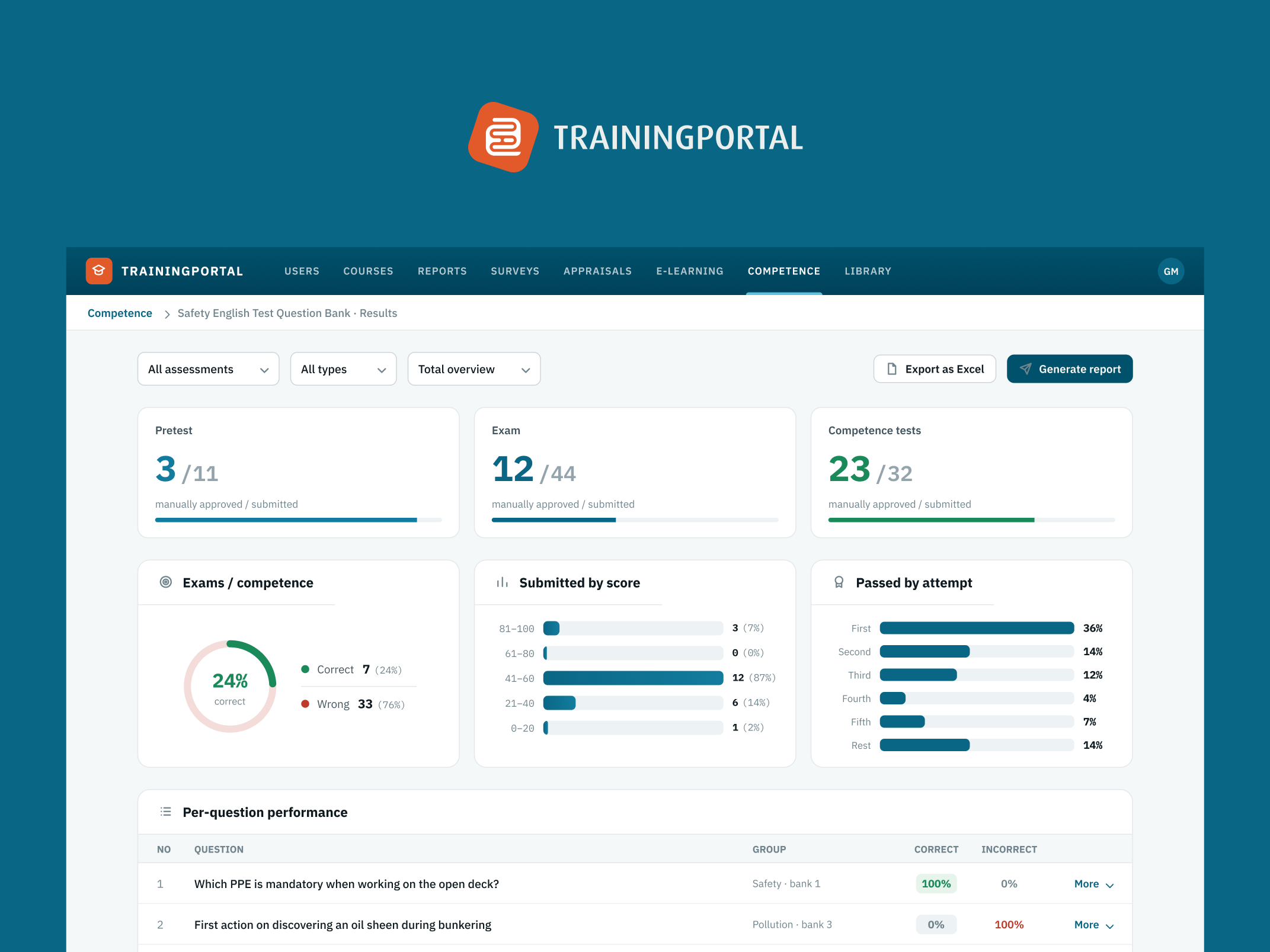
workers use Trainingportal
What I designed
The things I designed and shipped on this project.
- Graphical planner with 3-day, 6-week, 6-month and 12-month views
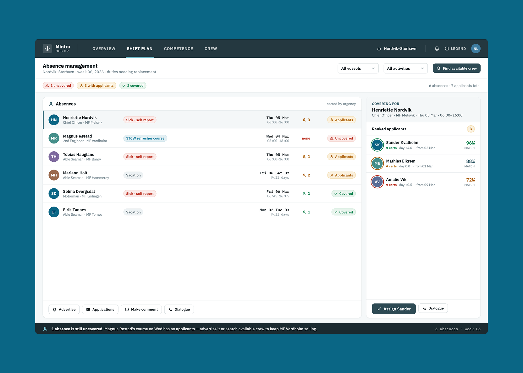
- Four-step absence management workflow
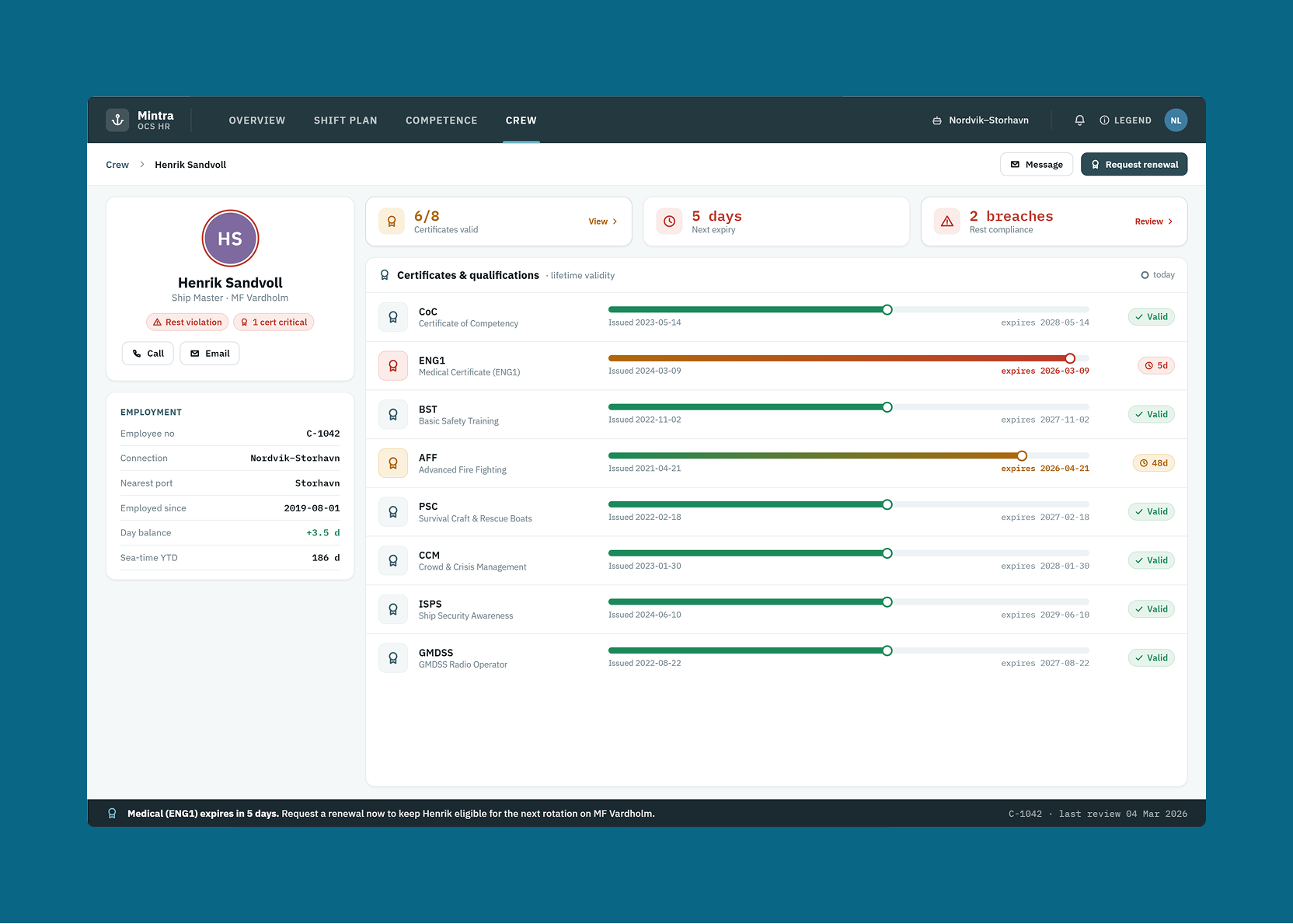
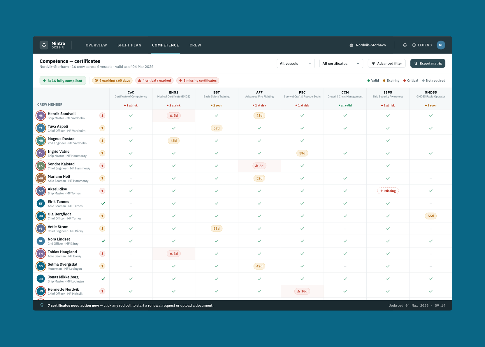
- Certificate and qualification tracking with compliance indicators
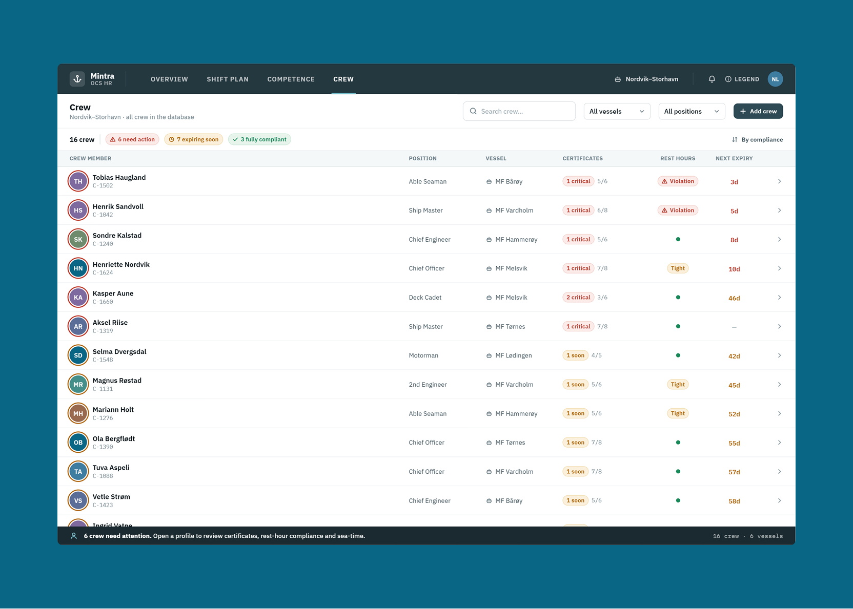
- Crew search and filtering
The brief
The problem, what I designed, and the result.
Planners, ship masters and crew use OCS HR every day across ships and installations worldwide. In safety-critical industries, staffing errors have real operational and safety consequences.
Redesigned the full system — shift planner, absence management, crew search, certificate tracking, and compliance monitoring.
Built for 2.2 million seafarers and energy workers: planners can find a qualified replacement quickly, ship masters can see at a glance that their roster is compliant, and crew know when a certificate renewal is coming.
The people using this every day
Three distinct user types interact with OCS HR, each with fundamentally different needs:
- Fleet planners — managing shift coverage across multiple ships, positions, and time horizons simultaneously. They need to see a lot of information at once and act on it fast.
- Ship masters — managing the crew on their specific vessel. They need clarity on who is scheduled, qualified, and requires attention.
- Crew members — checking their own schedules, upcoming assignments, and certificate status.
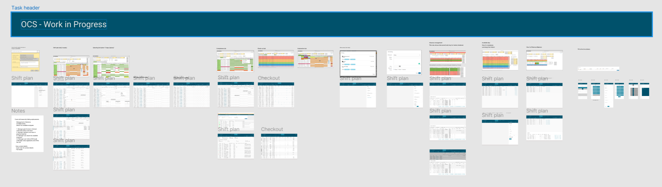
The existing system served none of them well. It was dense, hard to read, and slow to act on. Finding a replacement for someone who called in sick required navigating multiple screens with no clear structure. Certificate tracking was buried. The graphical planner — the screen planners lived in — was the most-complained-about part of the product.
Redesigning the graphical planner
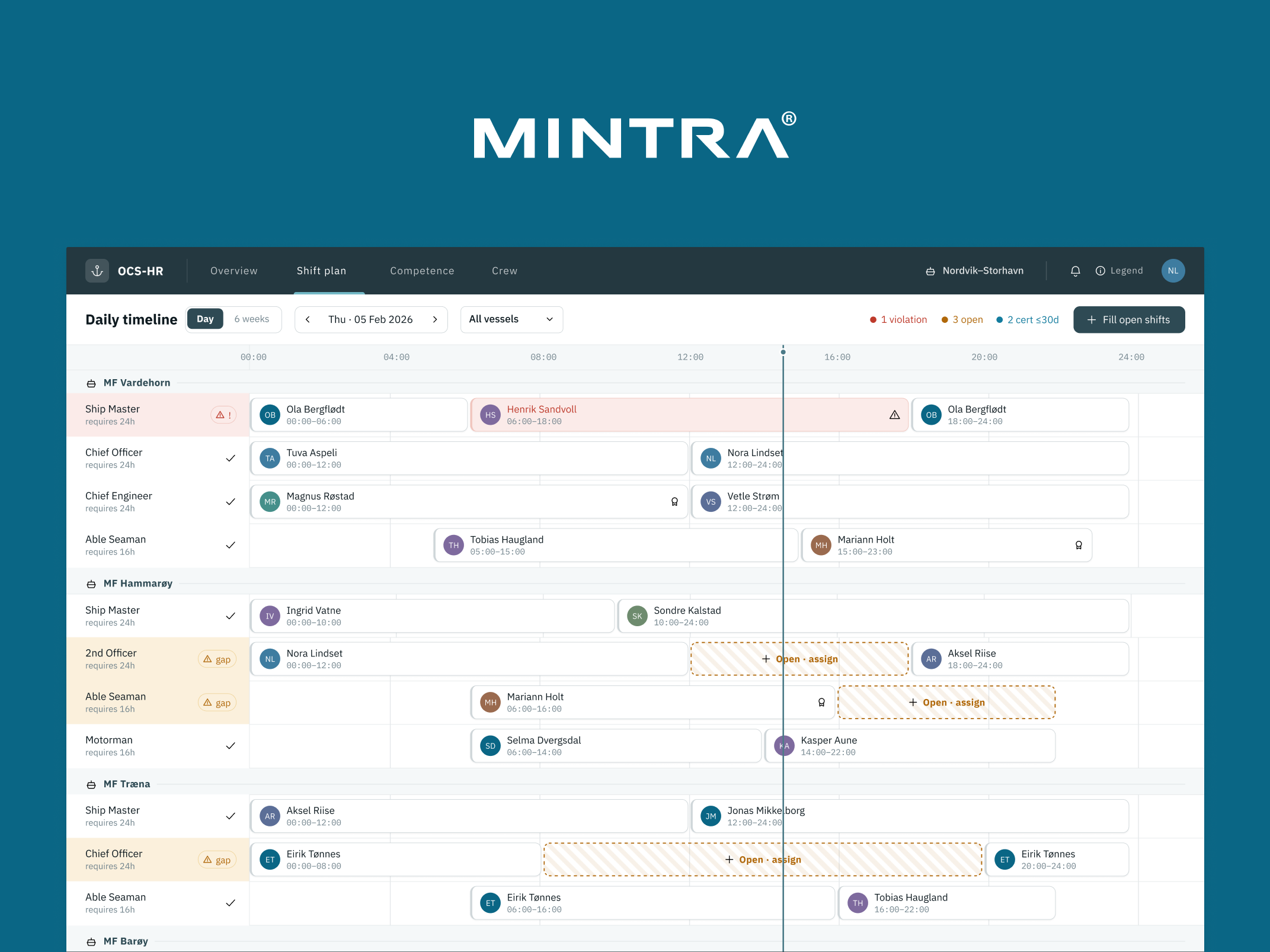
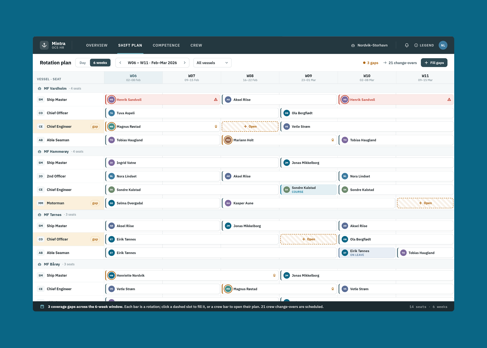
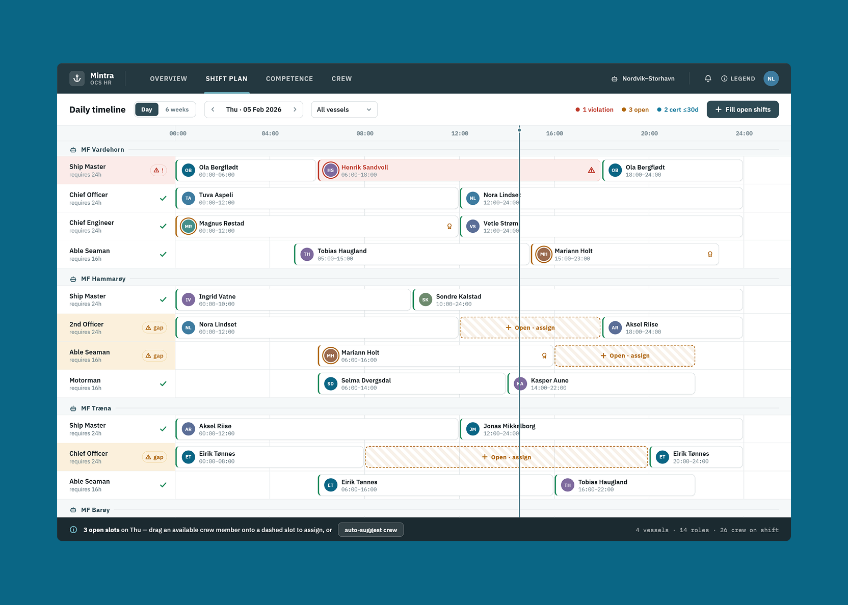
The graphical planner is the heart of OCS HR: a visualisation of who is assigned to which vessel, in which role, and when. Getting this right was the highest-priority design problem.
The fundamental issue: planners need to see different things depending on their planning horizon. What’s useful when planning for the next three days is completely different from what’s useful when planning quarterly rotations.
Four time views were designed — each calibrated to show the right level of detail for that planning context:
- 3-day view — granular, individual-level, focused on immediate coverage
- 6-week view — the operational planning window, showing rotation patterns and upcoming gaps
- 6-month view — medium-term planning, useful for identifying where recruitment is needed
- 12-month view — strategic overview for budget and headcount planning
Each view shows different data density and uses different visual encoding — the 3-day view emphasises individuals and positions; the 12-month view emphasises trends and gaps at fleet level.
Absence management — a four-step process
When a crew member can’t make their rotation, the planner needs a replacement quickly. In the old system, this was an unstructured process with too many places to get lost.
It was redesigned as a clear four-step sequence:
- Register the absence — record who is unavailable, the reason, and the time period
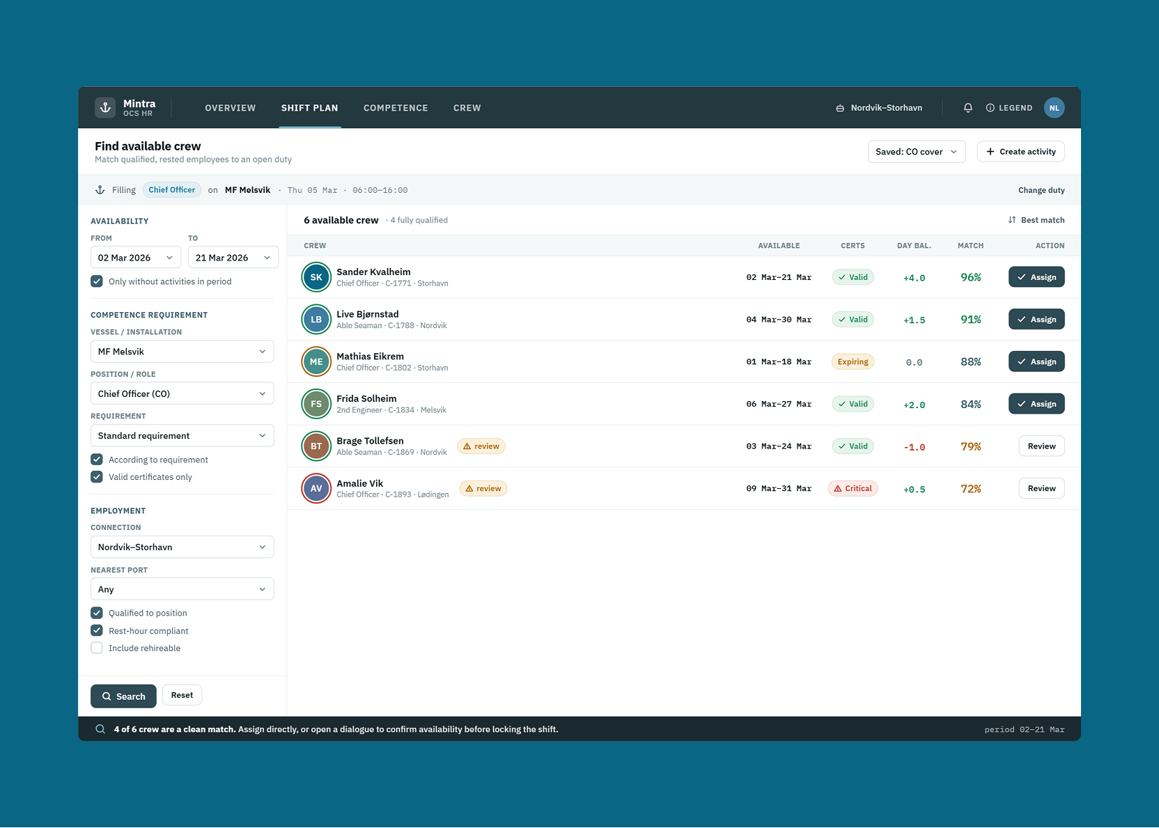
- Search for available crew — filter the crew pool by qualification, availability, and proximity
- Send an invitation — contact the selected replacement directly from the system with a pre-populated message
- Review and confirm — once accepted, confirm the assignment and update the schedule
Each step is distinct, the user always knows where they are in the process, and there’s no ambiguity about what to do next.
Certificate and qualification tracking
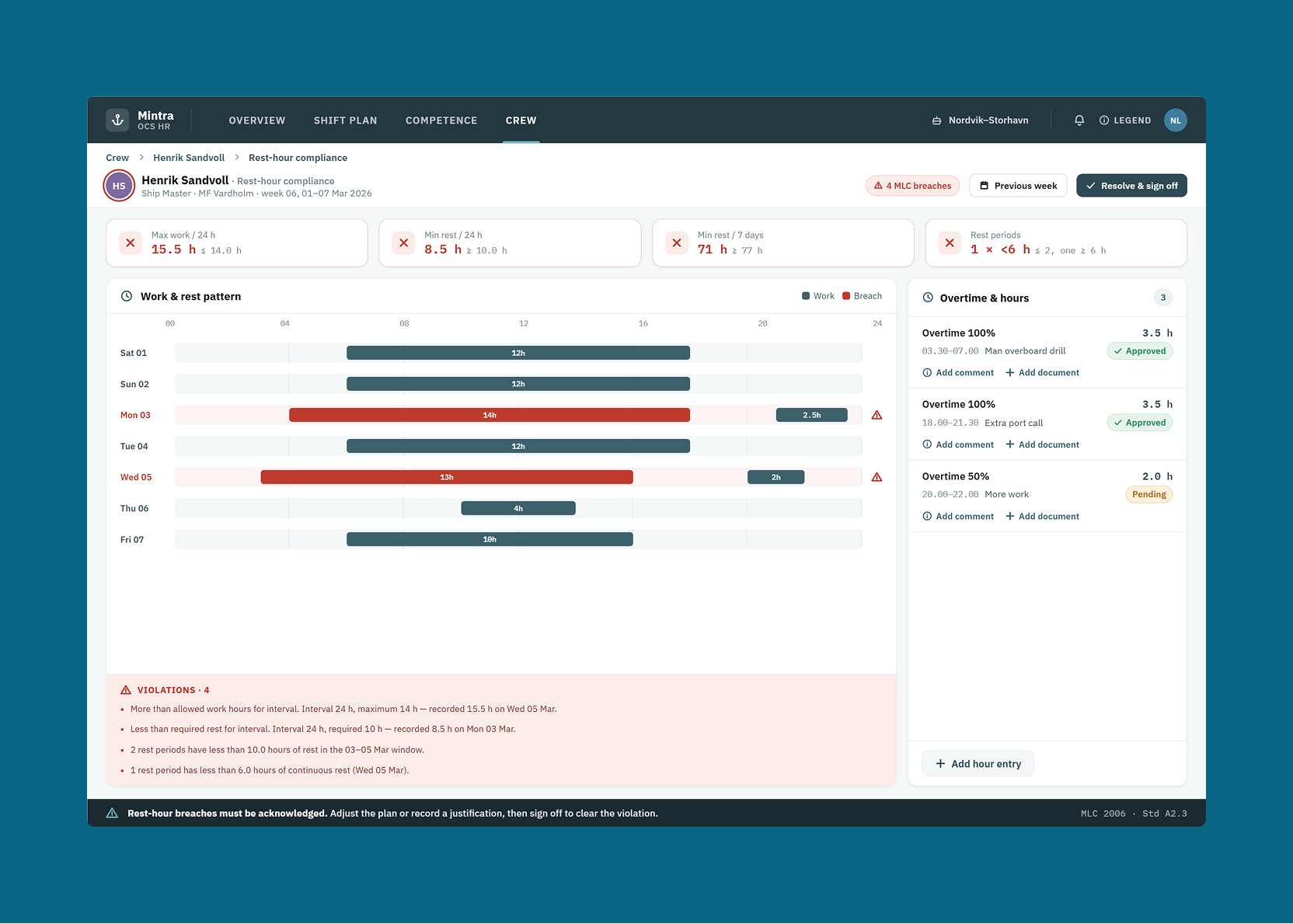
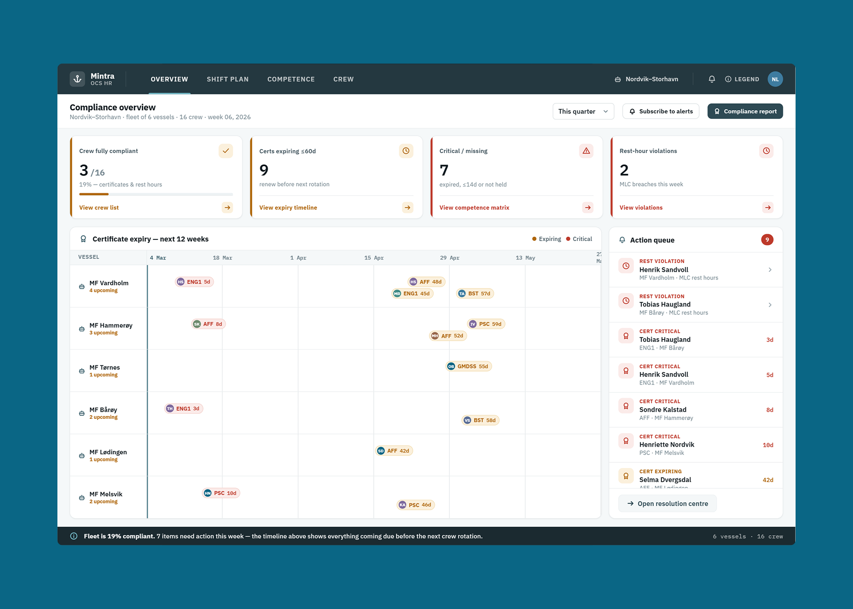
Maritime employment is heavily regulated — crew members need current certificates for specific roles, and vessels need compliant rosters. The old certificate tracking interface made it hard to see what was missing or expired without drilling into individual records.
The certificate view was redesigned to show compliance status at a glance: which crew members have current certificates for their assigned roles, which have expiring certificates requiring action, and which have gaps that need to be resolved before their next rotation. Colour-coded indicators and clear timelines replaced the dense table that required reading across multiple columns to understand any individual’s status.
Crew search and filtering
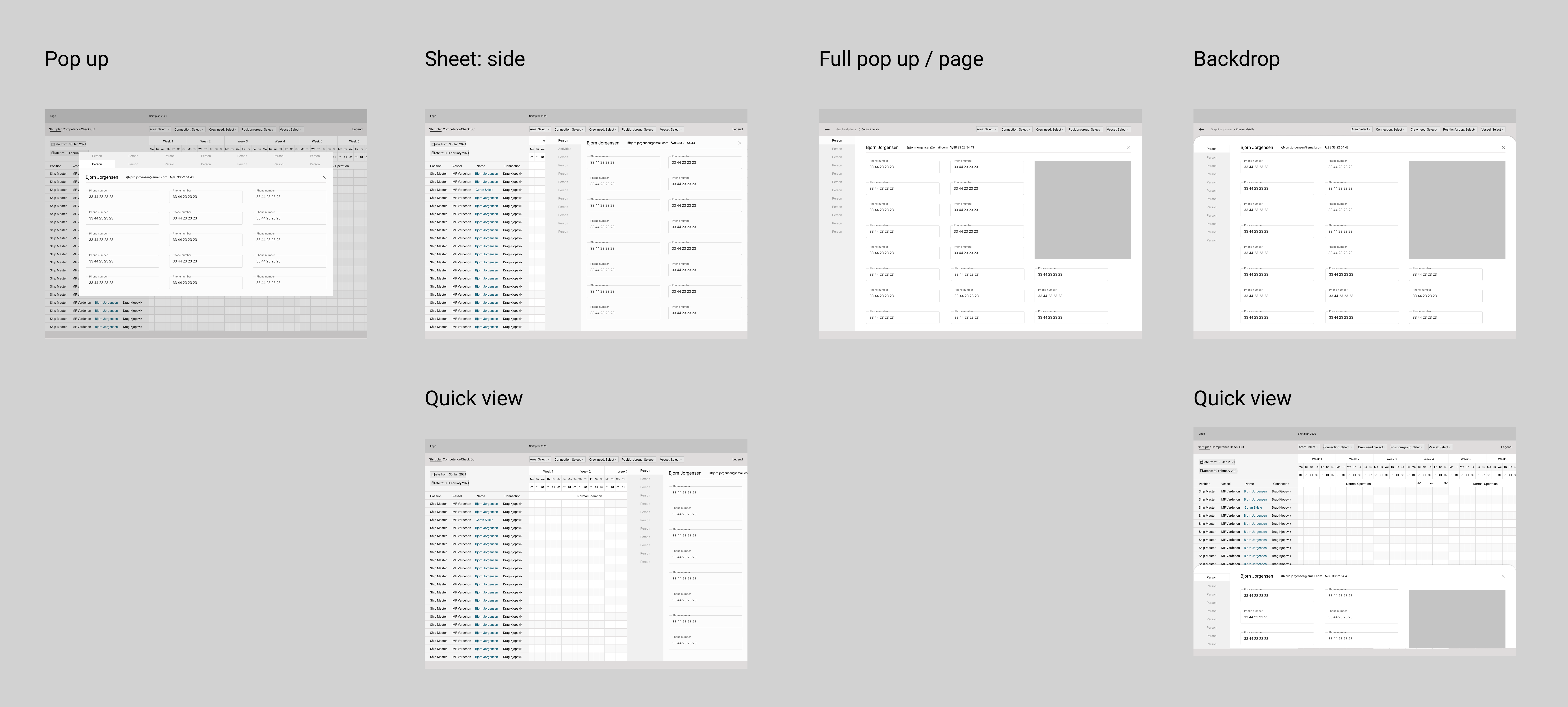
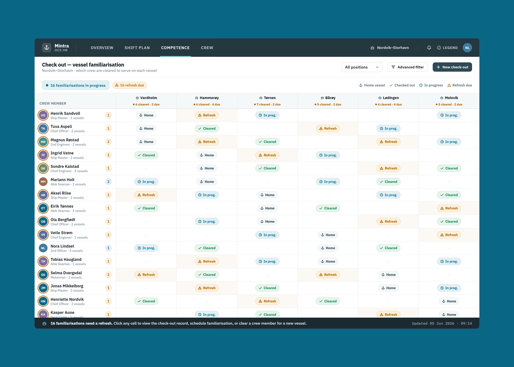
Finding the right replacement requires filtering by multiple criteria simultaneously — qualification type, availability window, contract type, home location, and sometimes vessel familiarity. Crew search was redesigned with a proper filtering interface that surfaced these dimensions clearly, so planners could narrow down a long crew pool to a relevant shortlist without running multiple separate searches.
What better usability means in this industry
For a platform used by 2.2 million seafarers and energy workers in safety-critical industries, usability isn’t just about efficiency — it’s about reducing the risk of staffing errors with real operational and safety consequences. A planner who finds a qualified replacement quickly, a ship master who sees at a glance that their roster is compliant, a crew member who knows their certificate renewal is coming — these are the outcomes the redesign was built to produce.
What the team said
More case studies




Book a 20-minute intro call
Slots show in your own time zone.
Let’s see if it’s a fit.
Twenty minutes is usually enough: the role, the product, and how your team works.


Ask AI about my work
AI answer, based on my case studies and CV
Answers show up here as they're written. I keep them short and point you to the case study they come from.
AI can get things wrong. If something matters, check the case study or email me at hi@gytismark.com.