How do I get up to speed on a new product without weeks of onboarding?
The audit process that gives me a full picture of any product in a few hours

The audit process that gives me a full picture of any product in a few hours
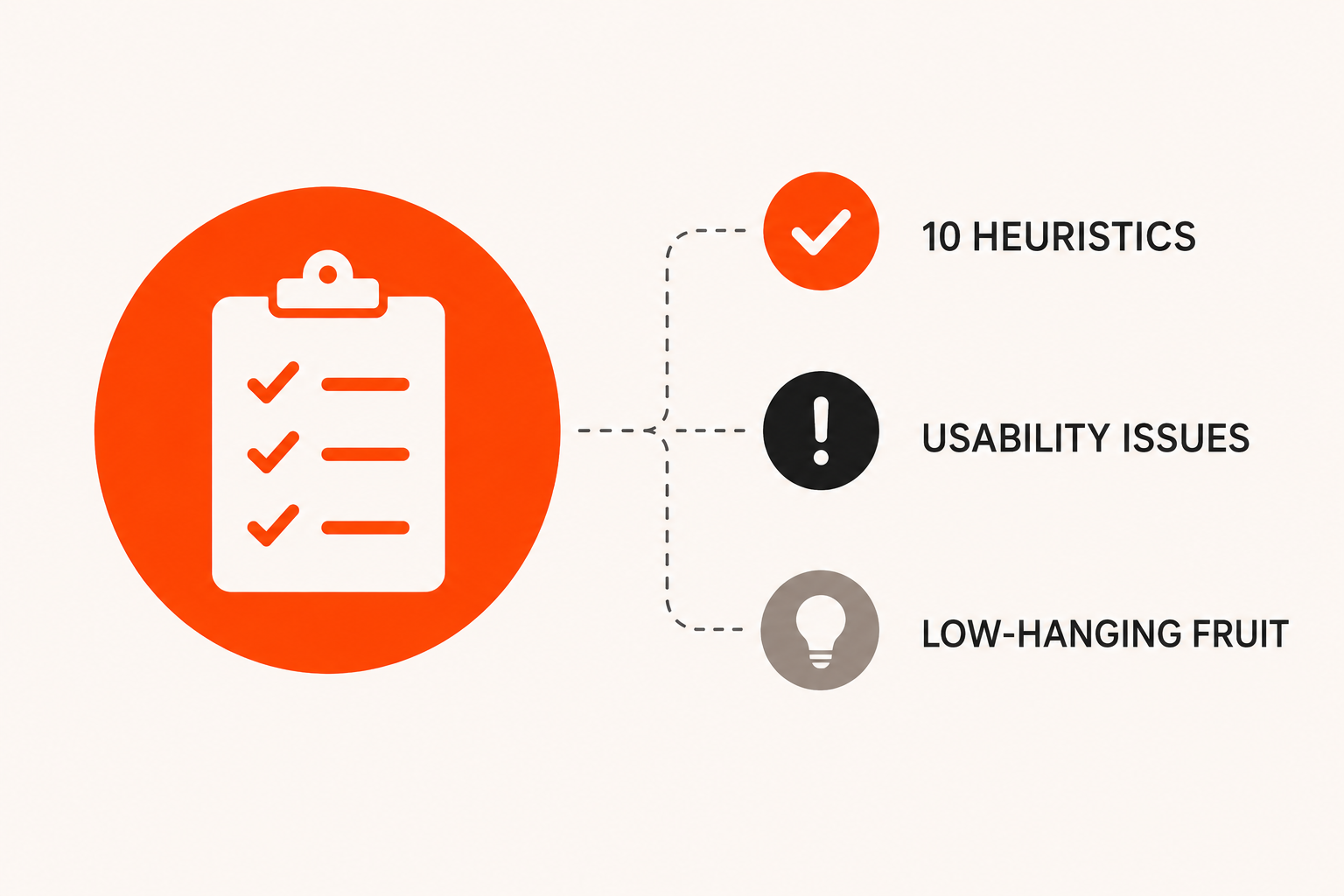
The first thing I do when I join any new product team is a product audit. I don't need documentation, onboarding sessions, or weeks to get familiar with how things work. Give me access to the product, and within a day I can have a solid picture of what's working, what isn't, and where to start.
It's not a complicated process, but it is a structured one. Here's exactly how I approach it.
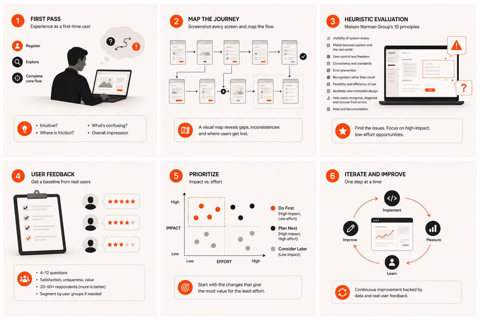
Start by being a first-time user
The first pass is deliberately surface-level. I ask for full product access — ideally a premium or admin account so I can see everything — but before using that, I'll sometimes sign up from scratch as a regular user first. The first-time user experience is one of the most important things to evaluate, and it's also the easiest to miss once you've been using a product for a while.
I go through the core flow without any guidance: registering, finding what I'm looking for, completing the main task the product exists to help with. I'm not hunting for problems yet — I'm forming an honest impression. Does this feel intuitive? Where do I hesitate? What's confusing? What makes me feel like I'm in the right place?
The freshness is the asset here. It disappears fast, so I take rough notes as I go rather than trying to remember it all afterwards.
Map it out visually
The second pass is more systematic. I go through the product again, this time taking a screenshot of every screen I land on. I then pull all of those screenshots into Figma and connect them with arrows — this action takes you here, that button opens this modal, this error state leads here.
It sounds low-tech, and it is. But having a visual map of the whole application laid out in front of you changes how you see it. Flows that felt fine when clicking through them suddenly look broken when you see the full path. Inconsistencies become obvious. Dead ends show up. You start to understand why certain parts feel off even if you couldn't articulate it while using the product.
This is usually where I make most of my detailed notes — not from using the product, but from stepping back and looking at the whole picture at once.
Run a heuristic evaluation
With the map in front of me, I work through Nielsen Norman's ten usability heuristics. These are ten principles covering the fundamentals of good interface design — things like whether the system gives users clear feedback, whether navigation is consistent and predictable, whether errors are handled gracefully, and whether the interface asks users to remember too much.
I've done this enough times that a lot of it is second nature — issues get flagged before I even reach the relevant heuristic. But I still use it as a checklist because it stops me from unconsciously skipping areas I'm less focused on that day.
This is where the low-hanging fruit shows up. Things that are genuinely hard to find. Copy that people read but can't understand. Flows that work technically but feel wrong to someone using them without context. These issues are usually high impact and relatively quick to fix — and they're the ones causing the most quiet frustration in real users.
Ask the users directly
If there's an existing user base — even a small one — I put together a short questionnaire. Anywhere from four to twelve questions depending on the product and what I need to understand. I'm not looking for detailed feedback at this stage; I'm looking for a baseline. How satisfied are people? Does the product feel unique? How would they feel if it stopped existing?
That baseline is what makes improvement measurable. Without it, you're making changes and guessing whether they helped. With it, you can run the same survey six months later and actually know.
A minimum of 20 to 50 responses gives useful signal. More is better, and if the product serves distinct user groups — different roles, different use cases, different levels of technical knowledge — each group needs to be surveyed separately, because their experience of the same product can be completely different.
Turn it into a prioritised list
Everything from the first impression, the visual map, the heuristic evaluation, and the survey feeds into one output: a list of things that need fixing, ordered by impact versus effort.
The things that are high impact and low effort go first. These are the ones most visibly broken for users but addressable without major engineering work — wording changes, navigation adjustments, missing empty states, unclear error messages. They're the easiest wins and they build momentum.
The bigger structural issues — flows that need rethinking, components that need redesigning, features built in the wrong order — those come later, with proper scoping and planning.
Why this works
The whole process takes a day, sometimes less for a smaller product. It doesn't require meetings, existing documentation, or anyone explaining how the product works. The audit tells me what I need to know — and often surfaces things the team has stopped noticing because they've been too close to it for too long.
That outside perspective is genuinely useful. It only exists at the very beginning, before the product starts to feel familiar. The audit is how I make sure I capture it before it's gone.
More writing

Book a 20-minute intro call
Slots show in your own time zone.
Let’s see if it’s a fit.
Twenty minutes is usually enough: the role, the product, and how your team works.


Ask AI about my work
AI answer, based on my case studies and CV
Answers show up here as they're written. I keep them short and point you to the case study they come from.
AI can get things wrong. If something matters, check the case study or email me at hi@gytismark.com.